Between IBM Plex Mono, Hack, Fira Code, and JetBrains Mono I think we Linux users are spoilt for choice when it comes to open-source monospace fonts that look good and work great.
Still, there’s always room for more, right?
Intel thinks so, hence the release of Intel One Mono. This is an “expressive monospaced font family that’s built with clarity, legibility, and the needs of developers in mind.” Better yet it’s not only free to download and use but free to edit, and free to redistribute.
Typography experts at Frere-Jones Type worked alongside Intel’s brand team and marketing company VMLY&R marketing to finesse the form, fit, and function of the Intel One Mono font.
But another important group of people had input in this glyph’s genesis: low-vision and legally blind1 developers. Yes, Intel One Mono isn’t just an “aww, looks nice” font. Intel says it makes reading and entering code easier, helps reduce eyestrain, and may possibly lessen fatigue.
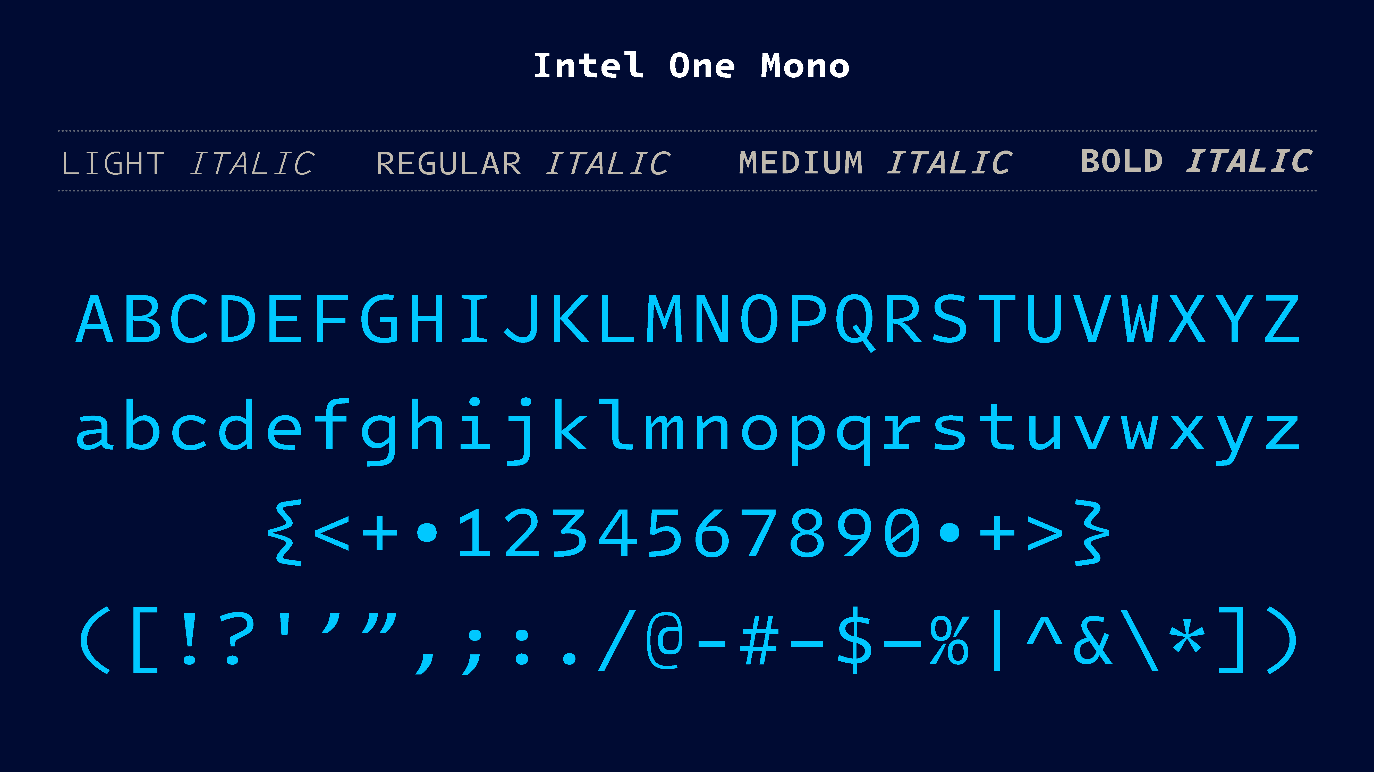
Intel One Mono supports over 200 languages using Latin script, and is provided in four weights (Light, Regular, Medium, and Bold) with matching italics.
Interested in trying this font out?
You can download Intel One Mono from GitHub. It comes as a .ZIP you’ll need to unpack, and inside that is the font you can install using your desktop’s default font viewer (assuming it has one). You can also manually install fonts by dropping them into the ~/.local/share/fonts folder.
The .ttf (as well as the .woff and .woff2 web fonts) are “manually optimized for screen display”, Intel say, and recommends using this version rather than the .otf version.
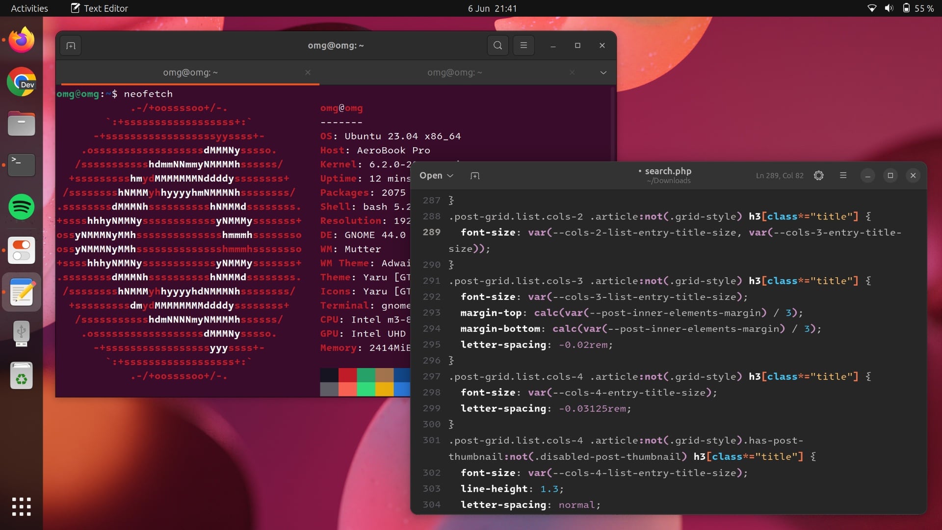
Intel One Mono looks best at a size of 9 pixels or larger. You can change your terminal font on Ubuntu on a per-app basis, or use the GNOME Tweaks tool to set a monospace font globally that (most) app will respect.
Top tip: Ubuntu Mono defaults to 13px on Ubuntu 23.04, so when selecting Intel One Mono you’ll want to drop this to ~11px. If you don’t do this things may look a bit engorged!
Overall, I think Intel One Mono looks great, especially in a text editor (GUI or CLI). There’s a noticeable upper and lower margin to the font that in dense text situations allows text to breathe, but in some terminal tools, like Neofetch, the gaps can seem a bit too happy.
1 Per Wikipedia, “‘Legally blind’ indicates that a person has less than 20/200 vision in the better eye after best correction (contact lenses or glasses), or a field of vision of less than 20 degrees in the better eye.”